The strategy of using candlestick charts in binary options trading involves combining candlestick analysis with other indicators, such as Bollinger Bands or RSI. This can significantly improve trading strategies and increase the chances of profitability. In this article, we will show you the best binary options candlestick chart patterns and how to use them effectively.

Key Facts About Candlestick Patterns:
- Candlestick charts are used in binary options trading to visualize asset price movements. They show open, close, high, and low values within a specific timeframe
- Each candlestick’s color and length indicate market trends and trader sentiment, with green/white suggesting price increases and red/black indicating decreases
- Recognizing candlestick patterns, such as bullish, bearish, and Doji, is crucial for predicting market movements and making informed trading decisions
- Combining candlestick analysis with other indicators, such as RSI and Bollinger Bands, can enhance trading strategies and improve the chances of profitability in binary options trading
Check out our binary options candlestick chart pattern video here for more details:
6 Best Binary Options Candlestick Patterns Explained:
Candlestick patterns are powerful tools for binary options traders, helping to interpret market trends and make informed decisions. By recognizing these patterns, traders can anticipate potential price movements and enhance their strategy. In this guide, we’ll dive into six of the most effective candlestick patterns that can give you an edge in binary options trading.

1. Bullish Pattern

When buyers dominate the market instead of sellers, a bulling pattern is formed. This means the closing price is higher than the opening price. Green or white represents the presence of bullishness in the market.
2. Bearish Pattern
The bearish pattern is the opposite of the bullish pattern. That means the sellers are controlling the market. After seeing the bearish pattern, one can conclude that the opening price is higher than the closing price. Also, it is represented by red or black color.
3. Doji Patterns
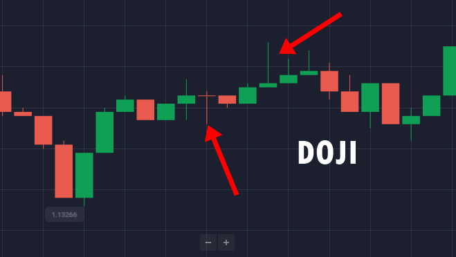
When the binary market is neither controlled by the bearish nor bullish, it shows the market’s indecision. And that’s when the Doji pattern is formed. This pattern is further divided into four parts.
Four different Doji patterns are common Doji, dragonfly Doji, Gravestone Doji, and long-legged Doji. But not all of them represent market indecisiveness. Traders can easily find a Doji pattern in the candlestick chart because it is represented by the cross shape.
Why We Like the Doji Method
While trading, if the market moves upward and there is a Doji pattern, you can conclude that the selling action is getting to start by slowing down the buying momentum.
If you exit the market based on Doji pattern analysis, you can make a considerable profit. But it’s important to confirm that the market is indicating just what the Doji pattern has shown. Otherwise, you could face a huge loss.
Understanding Different Doji Pattern Candlestick Variants
Here are the four popular Doji pattern variants and what they indicate:

Standard Doji
A standard Doji in the candlestick chart means buying and selling prices are the same. It’s represented by a cross or a plus sign.
Dragonfly Doji
Dragonfly Doji is the “T” shaped candlestick in the chart. It has a small body on the top, followed by a lower long wick. This pattern indicates that the market opened at a high price and came down. However, it increased to the same price level at the end of the trade. In a nutshell, dragonfly Doji is formed when the price is going down, but the buyers push it upwards at the last minute.
Gravestone Doji
Gravestone Doji is the opposite of Dragonfly Doji. This pattern is formed when the closing and opening price of an asset is at the same lower level. Gravestone Doji shows that when the market was opened, the sellers suddenly pushed down its price. Traders can make good profitability if they trade the gravestone Doji pattern.
Long-legged Doji
A long-legged doji looks similar to a common doji. However, it has a comparatively longer upper and lower wick, which shows the market’s indecisiveness.
When you see a long-legged Doji, try not to trade binary options (you should know when), as it can make you lose all of your invested money. Once the wick gets shortened, you can trade
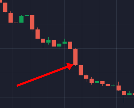
4. Bullish/Bearish Engulfing Pattern

The bullish and bearish engulfing patterns are popular candlestick patterns that provide clear signals of potential trend reversals, making them easy to spot on a chart.
In a bullish engulfing pattern, a downtrend is indicated, showing an increase in buying pressure as the market prepares to reverse. This pattern consists of two candles: the first is a red candle (indicating a downtrend), followed by a green candle that fully engulfs the body of the red candle, signaling a shift to a bullish trend.
The bearish engulfing pattern is the opposite, appearing when sellers dominate the market. It includes two candles as well: the first is a green candle (showing a previous uptrend), and the second is a red candle that fully swallows the green one, hinting at a reversal to a bearish trend.
5. Morning Star/Evening Star Pattern

The morning star and evening star patterns differ from bullish and bearish engulfing patterns by featuring three candles instead of two, each signaling a potential trend reversal.
A morning star pattern appears in a downtrend and consists of three candles: a long red candle, a small-bodied candle (often indicating indecision), and a green candle that closes higher, signaling a shift from bearish to bullish momentum. This pattern suggests that the price trend may soon reverse upwards.
In contrast, the evening star pattern signals a reversal from an uptrend to a downtrend. It includes a green candle, followed by a small-bodied candle, and finally a red candle that closes lower, indicating a bearish shift. These patterns often appear after higher highs or higher lows and can help traders anticipate reversals; however, to trade the evening star pattern successfully, it’s best to act quickly rather than waiting for the trend to fully decline.
6. Piercing Pattern
A piercing pattern is formed during a pullback or at the end of a downtrend. It is further divided into two categories: bearish candle and bullish candle.
This pattern can be found in the chart when the second candle, i.e., the bullish candle, is closed at the middle of the first candle, i.e., the bearish candle. This situation arises in the downtrend market.
What is a Candlestick Chart?
A candlestick chart is a tool used by traders while trading binary options. It is an easy way of better displaying the price movement of the assets traded in the options market.
A candlestick chart allows a trader to quickly understand the open, close, high, and low price of a commodity in a given time. Since this chart helps a trader understand the price movement quickly, it has become a reliable tool for trading.

A chart has several candlesticks, each of which signifies a trading session. By seeing an individual candlestick, a trader can understand the price of an asset in the near future.
The market analysis of candlestick patterns is more successful and accurate than any other binary options trading chart. That means this method of market review really works.
Candlestick vs. Bar Charts

Candlestick and bar charts both represent trading data, but candlestick charts are generally preferred for their clarity and visual appeal. Unlike bar charts, candlesticks use color and distinct shapes to highlight price changes more effectively, making it easier to spot trends and patterns at a glance. This visual advantage helps traders quickly interpret market movements and make informed decisions.
Reading Candlestick Charts
A trader can analyze an asset’s price movements by examining two key parts of each candlestick: the body and the shadow.
Each candlestick represents the price action over a specific timeframe, such as a day, week, or month, and shows four essential data points: the open, high, low, and close prices.
By observing the body and shadow of each candle, traders can gauge market sentiment and make informed trading decisions based on these insights.

Understanding the components of a candlestick is crucial for reading price trends on a chart. Each candlestick consists of two main parts: the body and the shadow, typically displayed in red and green colors. The shadow represents the high and low prices within a trading period, while the body shows the open and close prices.
Even small changes in the body color or shadow length can signal significant price fluctuations, providing valuable insights into market trends.
Color

In the green candlestick, represented in white, the top part shows the closing price of an asset, and the bottom part shows the opening price.
That means the market has moved upwards because the closing price is more than its opening price. Also, if the green color candlestick is long in size, it means that the particular asset has been purchased a lot in a given time.
On the other hand, in a red color candlestick, also represented in black, the bottom part indicates the closing price, and the top part indicates the opening price of an asset.
So, when the candlestick is red, you can interpret that the market has moved downwards. That’s because the opening price is more than the closing price. A long red color candlestick shows that a given item was sold a lot at a particular time.
In a nutshell, the color of a candlestick in the chart represents the price movement of an item.
Shadow

Like candlestick color, its shadow also indicates a change in the market. Since many traders fail to analyze the data represented by the wick and tail of a candlestick, they lose their money.
If the shadow is above the body of a candlestick, it’s called the wick. However, if the shadow is below, it’s called the tail. Also, the mood of the trading market can be interpreted by the length of the shadow.
The upper and lower shadow of a candle is almost never the same in size. When the candlestick’s wick is longer than its tail, it shows that the buyers controlled the market during the trading session.
Similarly, if the tail of a candlestick is longer than its wick, it means that the market sellers were active during the trading session. Irrespective of the position, a long shadow generally appears when a trend is about to end.
But if the wick and tail of a candlestick are of the same size, it indicates the indecisiveness of traders and buyers.
Candlestick Body and Shadow In Chart

Since you know what candlestick body and shadow mean, here’s what their size, ratio, and position mean in the chart.
Size of Candlestick Body
If the size of a particular candlestick in the chart increases continuously, its price has also increased. But if the length of the candlestick decreases, that shows the opposite, i.e., the price of the commodity has fallen in the market.
Candlestick Body to Shadow Ratio
If a candlestick has a long body compared to its shadow, it indicates strong price movement in the direction of the trend, suggesting momentum is building. As the trend continues, the candlestick bodies may grow, signaling sustained market strength.
Conversely, if the candlestick’s body is shorter than the shadow, it reflects weaker price movement in the trend’s direction and points to potential market uncertainty. This imbalance often suggests indecision among traders.
Body Position of Candlestick Pattern
Along with the candlestick size and ratio, the body’s position also plays a significant role.
For example, if the candlestick is small in size and has a long tail and wick, it means the price of a given asset has returned to its original value. It generally happens when the buyers try to increase the price while sellers are decreasing it.
The next position is when the candlestick is placed on one end and has a long shadow on its other side. It happens when the asset’s price has moved in a particular direction, either by the buyers or sellers.
What is the Candlestick Psychology for Binary Options Trading?

With candlesticks, you can read the psychology of the market in Binary Options trading. From our experience, the best way to read other trader’s minds is to interpret the wicks in candlesticks. See the picture below:
The wick is one of the best signals if you want to know in which direction the market will move. A lot of people are trading candlesticks, which means before the wick, other traders will see the full candle. Stronger other players are coming into the market and are pushing the market back. A rejection occurs, and we see the wick as a result. Many traders are trapped now in the wrong direction, and they need to close their positions.
By using wicks in Binary Options trading, we can generate a higher hit rate!
Watch our video about the psychology behind traders with candlestick strategy:
Proven Candlestick Chart Strategy for Binary Options Beginners:
I introduce you to two proven candlestick strategies for trading binary options. I often use them when I recognize that the market is taking a turn.
Support and Resistance Trading
I like to use the first strategy in 60-second binary options trades, and I want to illustrate it with a practical trade.
In this example, I trade the EUR/USD. First, I set the timeframe to 60 seconds. Then, I switch between the 60-second and 5-minute charts and take a close look at the support and resistance levels and the trendlines. This strategy aims to predict the next candle to generate profits with a short 60-second trade.

This strategy assumes trading within the ranges of support and resistance. I guess the price will rise, but I haven’t started the trade yet and am waiting for a confirmation candle.

As you can see in the picture above, there is a Hammer Candle. The hammer is a good signal that the market will move up.
Before I start the trade, I consult the RSI indicator and Bollinger Bands. This must be done quickly because trading is short-term. Both trading indicators suggest that the market will make a short-term move up. Because a hammer candlestick pattern confirms my assumption, I open a buy order.
I used a simple trading strategy to make 955 euros from 500 euros in this trade. The strategy is simple but effective because we have three times the confirmation that the courses will run as assumed. As a momentum indicator, the RSI indicator helps predict a trend’s speed and direction.
Breakout Trading

Breakout trading on a candlestick chart reveals when an asset’s price surpasses a key resistance or support level, signaling potential shifts in market direction. These levels often serve as strategic points for setting stop losses or entry positions, allowing traders to maximize profitability.
When a breakout occurs, traders have two options: they can exit the market to avoid potential losses or enter at the breakout point to capitalize on the anticipated price movement. After a breakout, market volatility typically rises as the price continues in the breakout direction, offering greater opportunities for profit due to the increased price fluctuations.
Fake Breakout Trading

The next candlestick trading pattern is the fake breakout, which acts as the opposite of a true breakout. As the name suggests, a fake breakout gives the illusion of a price surge beyond a support or resistance level, only to reverse back shortly afterward.
What makes the fake breakout particularly tricky is its unpredictability: the price appears to be breaking out, prompting traders to act, but then it quickly returns to its previous level. This pattern is easy to spot, even for beginners, and usually signals one of two things—either the existing trend will soon resume, or a trend reversal is imminent.
Fake breakouts often occur when traders enter during a stable phase, only for the price to suddenly reverse. This highlights the importance of timing in fake breakout trading.
Combine Candlestick With Other Indicators

The final approach to trading with candlesticks is combining them with other indicators. This strategy helps increase your chances of profitability while minimizing the risk of losses.
By using multiple indicators, you also expand your trading opportunities. With the right timing and strategy, this approach can lead you to greater success and help you develop into a skilled trader.
What If There Is a Single Candlestick?
If you choose to trade single candlesticks, you need to know the right way to read one single candle.
When you are trading a single candle and you notice a long upper shadow, the price will go down. It’s because investors want to sell. On the other hand, if you observe a long downward shadow, it means the market’s price is going up.
Similarly, if there is a Doji candle pattern, it shows indecision. This indicates the same opening and closing price. Lastly, if you notice a hammer pattern in the chart during trading a single candlestick, this means buyers are in action.
Conclusion: Use Chart Patterns To Win At Binary Options
Though several chart types are available for tracking price movements in the binary options market, candlestick charts are often the best choice. They are visually intuitive and provide a clear view of overall market sentiment.
For profitable trading, it’s crucial to select a candlestick pattern that offers comprehensive insights into price trends. With accurate information, you can make informed predictions and increase your chances of success.
To excel as a trader, focus on choosing effective candlestick patterns, following a well-defined strategy, and continuously building your knowledge.
For further reading, you can also read our ABCD pattern guide for Binary Options or Harmonic Pattern guide.
Most Asked Questions:
What is the primary purpose of a candlestick chart in binary options trading?
A candlestick chart displays the price movement of assets in binary options trading, helping traders quickly understand open, close, high, and low prices within a specific timeframe.
What do the colors and lengths of candlesticks indicate?
The color and length of candlesticks indicate market trends and trader sentiment. Green or white suggests price increases, while red or black indicates decreases.
What is the significance of the candlestick’s body and shadow?
The body of a candlestick represents the open and close range of an asset’s price, while the shadow (or wick/tail) indicates the high and low of the trade. Changes in their size and color can signify significant market fluctuations.
How does the candlestick chart differ from a bar chart?
Candlestick charts are preferred over bar charts as they present information more visually with colors, highlighting price differences more effectively.
What are some common candlestick patterns in binary options trading?
Common candlestick patterns include bullish and bearish patterns, Doji patterns (indicating market indecision), and specific formations like Dragonfly Doji and Gravestone Doji, each providing insights into market trends and potential reversals.
What is the importance of combining candlestick analysis with other indicators?
Combining candlestick analysis with other indicators like RSI and Bollinger Bands can enhance trading strategies, improving the chances of profitability by providing a more comprehensive view of market trends and potential price movements.


Enock Essandoh
says:I want to learn more
Julie
says:Hi very helpful information
thank you so much, just started trading binary.
JAT
says:very detailed information and I understand it easily. will test it in at once happy trading :)